

THE CONCEPT OF STATISTICS
- STATISTICS: is a discipline of collecting, organizing, analysing, interpreting and presenting numerical
OR
- Statistics: is a science of observing, collecting, recording, summarizing, analyzing and presentation of data in precise manner by using numbers.
- The numerical facts collected systematically are used for different geographical purposes. Example total rainfall, temperature and crop production per year.
- All figures found in written documents are known as STATISTICS.
- A person who collects, classifies, analyses, presents, and interprets data is known as
- DATA: means facts or pieces of information on particular [Data=plural, datum = singular].
TYPES/CATEGORIES OF STATISTICS
There are two (2) types of statistics;
I. DESCRIPTIVE STATISTICS
- This is the category of statistics that deals with a broad set of data collected from the field and summarized using statistical measures. Example; data from population census, crop production, rainfall, etc.
- This enable us to summarize large set of data by using statistical measures such as MEAN, MODE, MEDIAN and STANDARD DEVIATION
II.INFERENTIAL STATISTICS
- This is the type of statistics that deals with all procedures that enable one to draw conclusions and generalize the entire population by the use of samples.
- It deals with prediction or probability. g. the likely harvest output in the next year or season.
STATISTICAL DATA
Statistical data is a body of information of a particular phenomenon given in numerical form that can be organized, summarized and presented using different statistical methods.
They are of different types,
1. Primary data
- These are first-hand information about a particular
- They are obtained directly from the field; thus they are the data not available in the existing sources like books.
- These data are collected through questionnaires, observation, interviews and focus group
2. Secondary data
- These are those data obtained from published documents such as books, journals, magazines, articles, and government publications. They are second hand information.
TYPES OF STATISTICAL DATA ACCORDING TO THE NATURE OF DATA
1.DISCRETE DATA
This refers to data which can only be given as whole numbers, example number of people, animals, houses and vehicles.
The data do not exist in fractions. They only represent things which are not divisible.
2. CONTINUOUS DATA
These are the data which are presented to show a range of values. Example 0º to 30º. It can be in the form of fraction or decimals places. For example: data for temperature like 26.4 0C.
It includes data whose values can be measured such as pressure, rainfall, altitude, distance and years.
- Discrete and continuous data can be presented in form of individual or grouped
i. INDIVIDUAL DATA
This refers to the exact value or observation given to an individual item in a sample range. Example population in a country, number of students in a class/school.
For example; form I are 127, II are 97, III are 60 and IV are 36.
ii. GROUPED DATA
ø Refers to statistics without specific or exact figures but groups of several values. For example, age of students in a secondary school may be represented in groups as shown below.
| AGE GROUP | NUMBER OF STUDENTS |
| 13-14 | 48 |
| 15-16 | 70 |
| 17-18 | 62 |
NB:
- RAW DATA: are those data which have not been analyzed by the researcher or Example, 4, 3, 6, 7, 6, 2, 6, 1. They have not been arranged systematically, thus cannot be used to find median.
- ARRAY DATA: are those data which have already been analyzed and arranged in a systematic For example, 1, 2, 3, 3, 5, 6, 6, 6, 6, 7, 7. The value that divides the set is the Median 6.
IMPORTANCE OF STATISTICAL DATA TO THE USER
- They are used in land planning, resources allocation and provision of social
- Helps in forecasting future trends, comparison and explanation of different geographical
E.g. study of climate of an area could enable one to explain the types of vegetation.
- Helps to summarise raw and bulky data for easy interpretation and
- Enables us to convert massive data into a simple and manageable form by using measures of central tendency and dispersion for study purposes.
VARIABLES
- Variables: is an attribute [anything] that has values which fluctuate under a given
OR
- Refer to a measurable characteristics of a person, group or object that varies within the sample under
- For instance; production (e.g. of crops) change its values under conditions such as climate,
- Variables are classified into two major forms, namely;
- Independent variables
- Dependent variables
I. AN INDEPENDENT VARIABLES
It is the one whose values change on its own without being influenced by another variable.
These variables influence the changes of other variable or outcomes.
Examples: altitude, relief, years, age and distance. They are indicated on the x-axis.
II. DEPENDENT VARIABLES
It is the one whose values change (fluctuate) due to the force of another variable.
For example, the higher the altitude, the lower the temperature. They are indicated on the y-axis.
WAYS OF PRESENTING STATISTICAL DATA
- Data can be presented in several ways including statistical graphs, charts, proportional diagrams, tables and maps. Our focus will be on how bar graphs, line graphs and pie charts can be used to present data
TYPES OF GRAPHS
- Graphs are among the methods of used by geographers to present statistical There are two main types of graphs; these are line graphs and bar graphs.
THE CONCEPT OF STATISTICS
-
- LINE [LINEAR] GRAPHS
- These are the graphs that use lines to connect several points which relate to each other. They are used to compare two different variables over time.
Types of line graphs
- Simple line graphs
- Group/ comparative/multiple line graphs
- Compound/composite/cumulative/divided line graphs
- Divergent line graphs
- Percentage compound line graph
- BAR GRAPHS
- Are graphs that display data using rectangular bars or columns of different heights to represent such data. The greater the value, the longer the bar.
Types of bar graphs
- Simple bar graphs
- Group/comparative/multiple bar graphs
- Compound/composite/cumulative/divided bar graphs
- Divergent bar graph
- Percentage compound bar
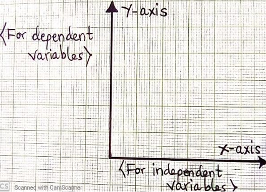
Ì NB: Any linear or bar graph has two axes;
- X-AXIS: -This is known as the BASE or HORIZONTAL It shows the values of INDEPENDENT VARIABLES. E.g. date or places.
- Y-AXIS: -This is known as the vertical It shows the values of DEPENDENT VARIABLES.
1. SIMPLE LINE GRAPH
- This is a type of graphs that are plotted by a single
- They show the variation of distribution of a single item using a line which is plotted against the
Procedure to Construct simple line graphs
- Identify/Study the data given careful
- Identify the variables g. from the data below;
- Dependent variable…….. production values
- Independent variable……. date (years)
- Vertical and horizontal scales The vertical scale should be selected on the basis of the largest value in relation to space available and the horizontal scale should be selected on the basis of number of years in relation to space available.
- Assuming that the graph space available is 10cm vertically;

- Horizontal scale is upon decision, example: 1cm to 1year.
-
- Draw vertical and horizontal lines to represent Y and X axis
- Present the data
- Remember to write the title/heading of the NB: The title is always derived from the question.
Qn. Consider the given hypothetical data below showing maize production for country X in “0,000’’ tones.
| YEAR | 1990 | 1991 | 1992 | 1993 | 1994 | 1995 | 1996 |
| PRODUCTION | 100 | 250 | 300 | 150 | 500 | 400 | 350 |
A SIMPLE LINE GRAPH SHOWING MAIZE PRODUCTION FOR COUNTRY X
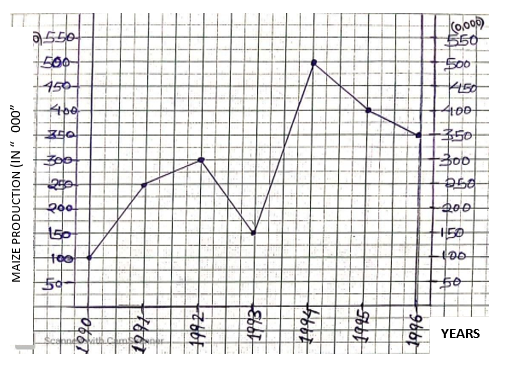
SCALES
V.S: 1cm to 500,000 tones; H.S: 1cm to 1 year Source: Hypothetical data.
2. SIMPLE BAR GRAPH
The procedures to construct a simple bar graph are similar to those of simple line graph. Simple bar graph may be drawn with a vertical or horizontal base.
All bars should be shaded uniformly.
Example, plot the following data on maize production in Tanzania from 1976 to 1984 in a simple bar graph.
| YEAR | 1976 | 1977 | 1978 | 1979 | 1980 | 1981 | 1982 | 1983 | 1984 |
| TONS (000) | 42 | 50 | 60 | 45 | 42 | 67 | 56 | 59 | 40 |
SOLUTION
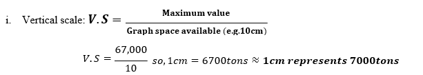
- Vertical scale: 𝑽. 𝑺 = 𝐌𝐚𝐱𝐢𝐦𝐮𝐦 𝐯𝐚𝐥𝐮𝐞
- 𝐆𝐫𝐚𝐩𝐡 𝐬𝐩𝐚𝐜𝐞 𝐚𝐯𝐚𝐢𝐥𝐚𝐛𝐥𝐞 (𝐞.𝐠.𝟏𝟎𝐜𝐦)
ii. Variables:
- Years; – independent variable
- Production (tons); – dependent variable
A SIMPLE BAR GRAPH TO SHOW MAIZE PRODUCTION IN TANZANIA FROM 1976-1984
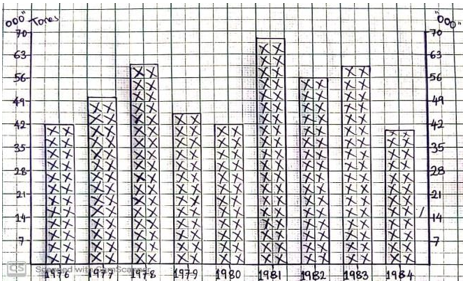
SCALES;
Vertical scale: 1cm represents 7000tons
Horizontal scale: 1cm to 1 year
Years
Bar width: 1cm Bar spacing: 0.5cm
ADVANTAGES/MERITS/STRENGTHS OF THE SIMPLE LINE AND BAR GRAPHS
- It is simple to draw; as it involves no complicated mathematical
- It is easy to read and interpret the data it
- It does not consume
- They give good visual impression g. bar graphs when well shaded.
- The exact value of an item can easily be estimated from the
- They represent only one item; thus they need no key hence it is much easier to
- It is used to compare production from one year to another (in the same variable/item).
DISADVANTAGES/DEMERITS/WEAKNESSES/SATBACKS OF THE SIMPLE LINE AND BAR GRAPHS
- It cannot represent more than one variable at a
- It is difficult to determine an exact value at a given point of the
- Construction of bars may lead to accumulation of some
- It does not offer comparison of different variables or
3. GROUP/COMPARATIVE/MULTIPLE LINE GRAPH
- These are the graphs that illustrate the values of more than one items using lines on the same
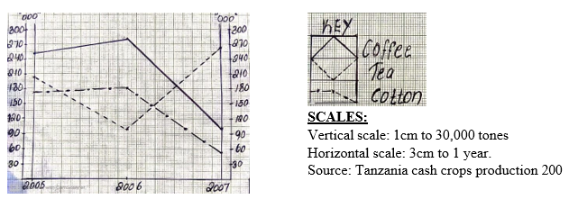
- For example; draw a group line graph to represent cash crops production in TZ from 2005 to 2007 in (‘000’tones).
| CROP/YEAR | 2005 | 2006 | 2007 |
| COFFEE | 250 | 280 | 100 |
| TEA | 200 | 100 | 275 |
| COTTON | 175 | 180 | 50 |
STEPS
- Identify the required data;
- Variables identification
- Independent variable – year of production
- Dependent variable – cash crops
- Vertical and horizontal scales estimation (consider the highest value, space and number of years)
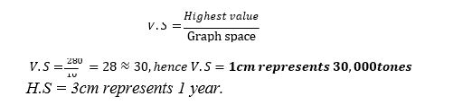
-
- Draw and divide the vertical axis (Y-axis) and horizontal axis (X-axis).
- Insert the values of the same year by drawing the
- Each item should retain its shading/line (colour).
- Write the caption of the graph, (title/heading), scale and the
A COMPARATIVE LINE GRAPH SHOWING CASH CROPS PRODUCTION IN TANZANIA FROM 2005-2007
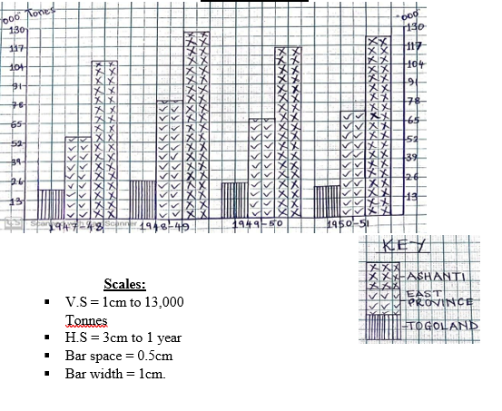
4.GROUP/COMPARATIVE/MULTIPLE BAR GRAPH
It is a form of statistical bar graph designed to have more than one bars of varied textures to illustrate the values of more than one items.
The procedures to construct are similar to those of group line graph.
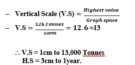
Qn. Draw a group bar graph to represent cocoa purchase by provinces in Ghana 1947/48-1950/51 in tonnes “000”.
| YEAR/PROVINCE | TOGOLAND | E. PROVINCE | ASHANTI | ||
| 1947/48 | 20 | 54 | 106 | ||
| 1948/49 | 26 | 80 | 126 | ||
| 1949/50 | 24 | 67 | 116 | ||
| 1950/51 | 22 | 72 | 123 | ||
| SOLUTION
Variables identification
Scales:
A MULTIPLE BAR GRAPH SHOWING COCOA PURCHASE BY PROVINCES IN GHANA (1947/48-1950/51)
ADVANTAGES/MERITS/STRENGTHS OF THE GROUP BAR AND LINE GRAPHS
DISADVANTAGES/SATBACKS OF THE GROUP GRAPH
|
|||||
5. COMPOUND/DIVIDED/COMPOSITE/CUMULATIVE/SUPERIMPOSED LINE GRAPH
- Are types of graphs where a variety of variables is presented as subsequent lines. A compound line graph is used to present multiple data of different items cumulatively in each year.
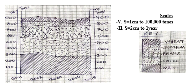
- For example; construct a compound line graph to show estimated production of crops in Mbinga district between 2001 and 2004 (in “000’’ Tonnes).
| CROP/YEAR | 2001 | 2002 | 2003 | 2004 | 2005 |
| Maize | 300 | 310 | 282 | 282 | 294 |
| Wheat | 50 | 61 | 65 | 49 | 67 |
| Beans | 150 | 180 | 163 | 134 | 170 |
| Coffee | 280 | 269 | 246 | 253 | 285 |
| Sorghum | 75 | 58 | 80 | 62 | 78 |
Procedures
- Variables identification
- Dependent variables—- Production of crops
- Independent variable– Date (years)
- Arrange the items/data starting with the highest item value to the lowest in a descending Example: from the question above the items can be arranged as follows;
Maize -first
Coffee-second
Beans-third Sorghum-fourth
Wheat-fifth
3. Establish a cumulative values table (by adding the values in each year).
| CROP/YEAR | 2001 | 2002 | 2003 | 2004 | 2005 |
| Maize | 300 | 310 | 282 | 282 | 294 |
| Coffee | 580 | 579 | 528 | 535 | 579 |
| Beans | 730 | 759 | 691 | 669 | 749 |
| Sorghum | 805 | 817 | 771 | 731 | 827 |
| Wheat | 855 | 878 | 836 | 780 | 894 |
4.Vertical and horizontal scales determination

𝑯𝒊𝒈𝒉𝒆𝒔𝒕 𝒄𝒖𝒎𝒖𝒍𝒂𝒕𝒊𝒗𝒆 𝒗𝒂𝒍𝒖𝒆
5.Plot the cumulative values in the frame work (x and y axis).
6.Shade the segments of each line/bar, and each SEGMENT must retain its
7.Finalise by indicating the key to show what each shading represents and the
A COMPOUND LINE GRAPH SHOWING THE ESTIMATED PRODUCTION OF CROPS IN MBINGA DISTRICT BETWEEN 2001 AND 2004 (IN “000” TONES)
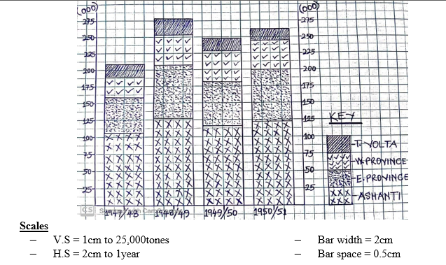
6. COMPOUND/DIVIDED/COMPOSITE/CUMULATIVE/SUPERIMPOSED BAR GRAPH
These are graphs drawn by dividing one bar into several components. Instead of bars being placed side by side, the component parts are placed on top of one another.
Each bar represents certain items and the total length of each bar represents the total value of all variables during the said period/year.
The procedures are the same as those of compound line graph.
- For example: construct a compound bar graph using the following data showing cocoa production in Ghana in thousand tonnes.
| REGION/YEAR | 1947/48 | 1948/49 | 1949/50 | 1950/51 |
| Ashanti | 106,000 | 126,000 | 116,000 | 123,000 |
| West Province | 28,000 | 46,000 | 40,000 | 45,000 |
| East Province | 54,000 | 80,000 | 67,000 | 72,000 |
| T. Volta | 20,000 | 26,000 | 24,000 | 22,000 |
Procedures
- Variables identification
Dependent variables =Export values Independent variable =Date/years.
- Arrange the items from the highest value to the lowest in a descending
- Prepare a cumulative values table;
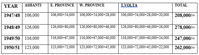
3.Choose a suitable scale for dependent and independent
4.Draw the graph, insert the values for each component part;
5.Choose a pattern or colouring for each component part
6.Insert a title, key and
-
A COMPOUND BAR GRAPH SHOWING COCOA PURCHASE BY PROVINCES IN GHANA FROM 1947/48 TO 1950/51
Advantages/strengths/merits of cumulative line and bar graph.
- They represent more than one item; thus very useful for comparative
- They give good visual impression especially bar graph due to
- It is easy to interpret due to different patterns and colouring, especially cumulative bar
- Exactly values can easily be estimated from the graph, because it does not involve long mathematical
- It does not consume much time because several lines representing each independent variable are
- They present the trend of data in different
- They are detailed in providing information, thus save
Disadvantages/weaknesses/demerits of cumulative line and bar graph
- It needs high skills to read and interpret the
- It is hard to choose a suitable scale when data differs by a great
- It can cause confusion when many variables are cumulative and not all values start from
- The graph cannot establish the cause of variation in the
- The graph does not present actual data because it presents cumulative
- If key is not used it may lead into confusion in their
- The methods do not show rise and fall in production of an individual component or
NB: It is recommended to write the actual value on the face of each bar, since all component parts do not start upon the same base.
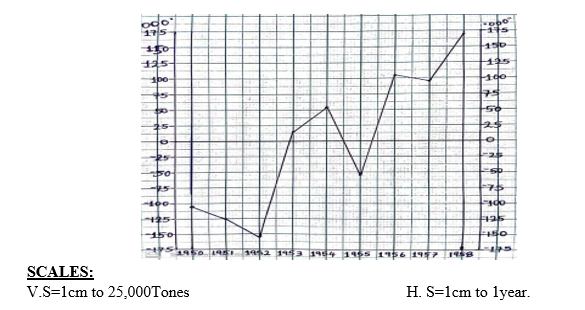
7. DIVERGENT LINE GRAPH
- This is a line graph which explains how variable values deviate from the mean. It shows fluctuations (rise or fall) of values from the average.
- They are LOSS and GAIN graphs which may show divergence or variation between EXPORTS and IMPORTS or profit and loss.
Procedure to construct a divergent line graph
For example: Draw a divergence line graph of the world Cocoa production (in Tons) from 1950-1958
| YEAR | 1950 | 1951 | 1952 | 1953 | 1954 | 1955 | 1956 | 1957 | 1958 |
| TONES | 450,000 | 430,000 | 400,000 | 570,000 | 610,000 | 500,000 | 660,000 | 650,000 | 725,000 |
STEPS:
- Determine the variables (dependent and independent variables).
- Calculate the arithmetic mean (average) of the given

- Compute the deviation values by subtracting AVERAGE from each item
WORKING TABLE
| YEAR | PRODUCTION IN TONES (𝓧) | AVERAGE
(𝓧̌) |
SUBTRACT AVERAGE FROM PRODUCTION (𝓧 − 𝓧̌) |
RESULTS (USE TO DRAW THE GRAPH) |
| 1950 | 450,000 | ∑ 𝓧
𝓧̌ = 𝑵 𝟒, 𝟗𝟗𝟓, 𝟎𝟎𝟎 𝓧̌ = 𝟗
𝓧 = 𝟓𝟓𝟓, 𝟎𝟎𝟎 |
450,000–555,000= | –105,000 |
| 1951 | 430,000 | 430,000–555,000= | –125,000 | |
| 1952 | 400,000 | 400,000–555,000= | –155,000 | |
| 1953 | 570,000 | 570,000–555,000= | 15,000 | |
| 1954 | 610,000 | 610,000–555,000= | 55,000 | |
| 1955 | 500,000 | 500,000–555,000= | –55,000 | |
| 1956 | 660,000 | 660,000–555,000= | 105,000 | |
| 1957 | 650,000 | 650,000–555,000= | 95,000 | |
| 1958 | 725,000 | 725,000–555,000= | 170,000 | |
| TOTAL | 4,995,000/= |
- Put the zero line at the centre of the graph as an The line must be thickened for the purpose of interpretation.
- Choose a suitable
- Draw a horizontal line and vertical line whereby positive values are shown above the zero line and negative values below the zero line.
- For divergence bar graph, shade neatly, and write the Title, and scale
A DIVERGENCE LINE GRAPH SHOWING THE WORLD COCOA PRODUCTION (IN TONES) FROM 1950-1958
8.DIVERGENT BAR GRAPH
It is a form of bar graph designed to illustrate the increase and decrease of the data in relation to the mean.
The graph is designed to have upper and lower sections showing POSITIVE and NEGATIVE values.
The procedure for construction are the same as those for constructing divergent line graph. However, vertical bars are used where positive values are presented by bars pointing upwards and negative values presented by bars pointing downwards of the zero line.
For e.g. construct the divergent bar graph showing the assumed average income (Tsh) of 10 families of Mafumbi village over six months in 2006.
| FAMILY | GIMBI | DIBWAGALE | JAHILE | KIFYAGI | PENZA | MPILI | GODA | MISAPE | UREMBO | UMWAGALE |
| INCOME | 20,000 | 35,000 | 15,000 | 45,000 | 30,000 | 10,000 | 5,000 | 50,000 | 15,000 | 5,000 |
SOLUTION
A.Variables identification
- Dependent variable —Income (indicated in Y-axis).
- Independent variable—Families
B.Calculate the Arithmetic mean (average)
C.Compute the deviation
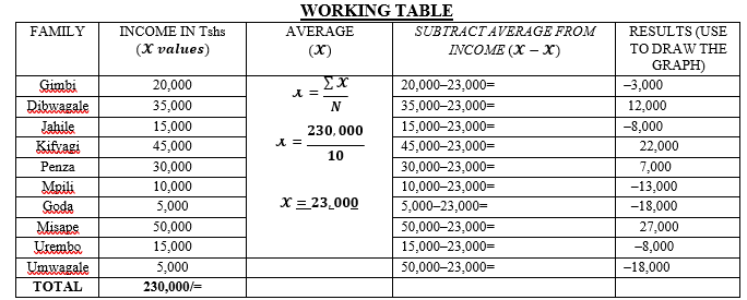 4.Estimation of the scales (V.S) and (H.S). example;
- V.S = 1cm to 5,000 Tshs.
- H.S = 1cm to 1Family.
A DIVERGENT BAR GRAPH SHOWING FAMILY INCOME IN TSHS OVER SIX MONTHS IN 2006
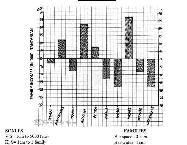
MERITS/ADVANTAGES OF THE DIVERGENT LINE AND BAR GRAPH
- Fluctuation in values is shown. This helps to detect a problem in the behaviour of the
- It easy to determine the profit and loss or increase and decrease of items
- They give good visual impression, example bar
- They are simple to read and easy to
- They are simple to
IT’S DEMERITS/DISADVANTAGES
- Construction of divergent line/bar graphs is tiresome since it involves
- It is limited to only one item; hence it is not suitable for many
- It is time-consuming due to several steps in
- It requires high skill to reveal the actual values of the item
- There is a possibility of drawing a wrong graph, if the calculations are
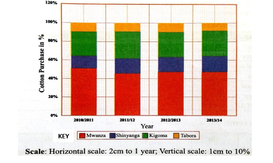
9. PERCENTAGE COMPOUND BAR GRAPH
This is a bisected column graph used to compare the percentage that each value contributes to a total of 100% across categories.
To draw a sub-divided bar chart on a percentage basis, we express each component as the percentage of its respective total.
In drawing a percentage bar chart, bars of length equal to 100% for each class/year are drawn at first step, and sub-divided in the proportion of the percentage of their component in the second step.
Procedure for Constructing a percentage bar graph
- Set/calculate the total of the data for each year;
- Calculate the percentage of each data set for each year;
- Draw the vertical axis (y-axis) to represent the dependent
- Draw the horizontal axis (x-axis) to represent the independent variables;
- Label both axes using a suitable scale;
- Plot the cumulative percentage values for each year and subdivide the bar according to their percentage
- Indicate the key and title for more
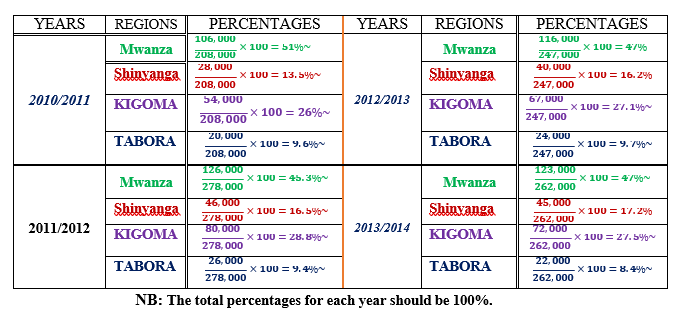
Qn. Carefully study the table below showing cottons purchase in Tanzania from 2010/2011 to 2013/2014.
| Region/Year | 2010/2011 | 2011/2012 | 2012/2013 | 2013/2014 |
| Mwanza | 106,000 | 126,000 | 116,000 | 123,000 |
| Shinyanga | 28,000 | 46,000 | 40,000 | 45,000 |
| Kigoma | 54,000 | 80,000 | 67,000 | 72,000 |
| Tabora | 20,000 | 26,000 | 24,000 | 22,000 |
| Totals | 208,000 | 278,000 | 247,000 | 262,000 |
Solution
NB: The total percentages for each year should be 100%.
A PERCENTAGE COMPOUND BAR GRAPH TO SHOW COTTON PURCHASE CHANGES FROM 2010/2011 TO 2013/2014
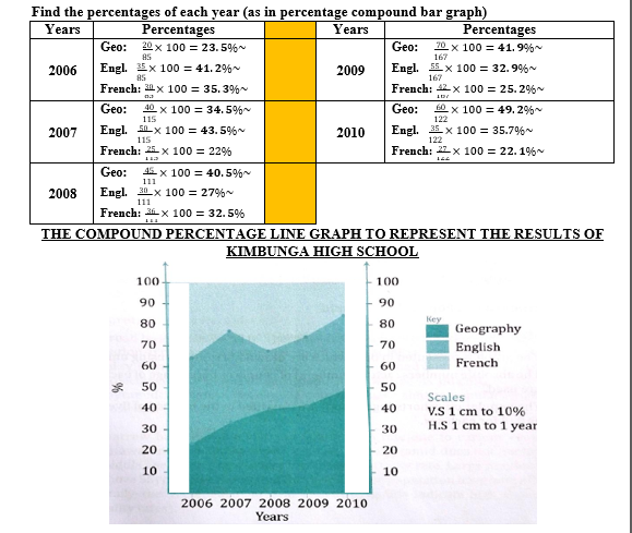
10. PERCENTAGE COMPOUND LINE GRAPH
S The procedure of representing percentage compound line graph is the same as the one for compound line graph. However, in percentage compound line graph, the total length should be at 100%.
S Example: use the following table on terminal results of Kimbuga High School to construct a compound percentage line graph.
| Subject /Year | 2006 | 2007 | 2008 | 2009 | 2010 |
| Geography | 20 | 40 | 45 | 70 | 60 |
| English | 35 | 50 | 30 | 55 | 35 |
| French | 30 | 25 | 36 | 42 | 27 |
| TOTAL | 85 | 115 | 111 | 167 | 122 |
Solution
Find the percentages of each year (as in percentage compound bar graph)
THE COMPOUND PERCENTAGE LINE GRAPH TO REPRESENT THE RESULTS OF KIMBUNGA HIGH SCHOOL
PERCENTAGE COMPOUND LINE GRAPH
The procedure of representing percentage compound line graph is the same as the one for compound line graph. However, in percentage compound line graph, the total length should be at 100%.
Example: use the following table on terminal results of Kimbuga High School to construct a compound percentage line graph.
- PIE CHART/ SIMPLE DIVIDED CIRCLE/ PIE GRAPH
Pie chart: is a circle divided into sections/slices such that the area of each segment is proportional to the size of figure it represents.
Pie graph is prepared by dividing a circle of 360º in relation to each variable out of 100% of its total variables, that is, 1% =3.6º.
- For example; use the following data on performance in Biology by class average to draw a pie
| FORM | 1 | 2 | 3 | 4 | 5 | 6 |
| MARKS % | 85 | 80 | 78 | 78 | 65 | 70 |
Procedures/Steps for construction of a pie Chart
- Compute the total of the values to be represented
- Find the percentages of each value using the grand total and find out their Check if the total of the degrees makes 360º, and the percentages if it is equal 100%.
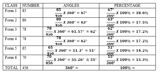
- Draw a circle of a reasonable/convenient size and divide it using a protractor into segments corresponding to the degree of each value.
NOTE: Draw a radius from the 12 O’clock mark, to the centre of a circle, so as to get a starting point in dividing the circle.
- The largest component is usually placed to the right of 12 o’clock arm, and continue in descending order for the other components.
- Label and shade each segment. Darker colours are best used for the smaller segments.
NOTE: If the space is not enough to write inside, write outside and then indicate by an arrow.
- Complete the pie chart by giving its
A SIMPLE DIVIDED CIRCLE SHOWING PERFOMANCE IN BIOLOGY TEST BY CLASS AVERAGE
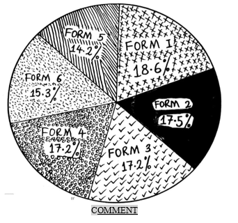
- The data shows that Form one students got the best average pass mark while Form five students got the worst average.
ADVANTAGES OF DIVIDED CIRCLES
- It is easy to compare components within a circle as they are represented by
- Easy to read and interpret as they use both degree and
- It gives good visual impression, hence improves understanding of the
- Construction is relatively simple and
- It illustrates statistical information very
- It is easy to determine the value of each component since it is indicated on each
DISADVANTAGES/SETBACKS OF THE PIE CHART
- It is time consuming as it involves a lot of
- It does not give the actual values of items represented, as values shown are hidden by percentages or degrees.
- A problem may arise in selecting the varied shade
- It needs high skill to prepare
- It is difficult to visualize the proportional differences between values, where the data values vary
SUMMARISATION OF MASSIVE DATA
Raw data collected from various sources needs to be organized in a summary form. This is done through the use of frequency distribution tables.
Frequency Distribution
- Frequency distribution: is the organization of raw data in table form using classes and
- Frequency: means the number of times a score or event
- The technique consists of a table in which different scores/values are arranged in a
descending/ascending order.
- Example: Summarize/organize the raw information of the size of 20 families interviewed as follows; 3, 2, 2, 4, 3, 7, 8, 1, 3, 6, 2, 2, 4, 5, 6, 4, 3, 4, 5 and 2.
SOLUTION
The data have been arranged in descending order.
| SCORE | TALLY | FREQUENCY(number of occurrence) |
| 8 | I | 1 |
| 7 | I | 1 |
| 6 | II | 2 |
| 5 | II | 2 |
| 4 | IIII | 4 |
| 3 | IIII | 4 |
| 2 | IIII | 5 |
| 1 | I | 1 |
- For the large number of scores or events involving a whole region, the data can be summarized by the use of GROUPED FREQUENCY.
STEPS INVOLVED IN MAKING GROUPED FREQUENCY
- Decide the size of the class interval and should be
- A score appears only once; that means no score should belong to more than one
- The range of class intervals should be between 3 and
- Arrange the class intervals in order of ranks; preferably in a descending
For example; Summarize the following data: 10, 5, 6, 12, 17, 20, 82, 79, 66, 50, 53, 88, 68, 47, 75,
60, 59, 73, 40, 39, 24, 15, 23, 62, 51, 41, 48, 71, 55, 58, 67, 38, 23, 24, 54, 35, 29, 26, 27, 16, 8, 10,
14, 19, 18, 3.
| CLAS
INTERVAL |
TALLY | TALLY FREQUENCY |
CUMULATIVE
FREQUENCY |
||
| 80-89 | II | 2 | 46 | ||
| 70-79 | IIII | 4 | 44 | ||
| 60-69 | IIII | 5 | 40 | ||
| 50-59 | IIII II | 7 | 35 | ||
| 40-49 | IIII | 4 | 28 | ||
| 30-39 | III | 3 | 24 | ||
| 20-29 | IIII III | 8 | 21 | ||
| 10-19 | IIII IIII | 9 | 13 | ||
| 0-9 | IIII | 4 | 4 | ||
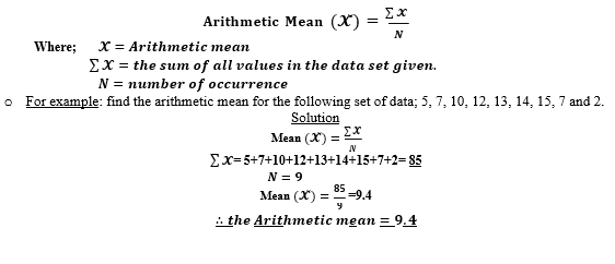
| From the summarized data above, one can identify two concepts: Cumulative frequency: refers to the consecutive summation of each frequency per class. APPARENT UPPER LIMIT: this closes the class interval e.g. 89, 79, 69, 59, 49, 39, 29, 19, 9. APPARENT LOWER LIMIT: this opens the class interval e.g. 80, 70, 60, 50, 40, 30, 20, 10,and 0. The table has also REAL LIMITS which are not visible. These are 0.5 BELOW or ABOVE the apparent limits. Example, 70-0.5 =69.5 or 79+0.5=79.5. SIMPLE STATISTICAL MEASURES AND INTERPRETATINS These are statistical measures and techniques used to summarise and show the distribution of data. They indicate where the centre of distribution tends to be located. Their role is to facilitate comparison of data. They are broadly divided into the following categories; a) Measures of central tendency b) Measures of variability. 1. MEASURES OF CENTRAL TENDENCY These are measurements which show the central values. It involves; a. Arithmetic mean c. Median b. Mode A. ARITHMETIC MEAN ♥ Is an average of all values in a set of distribution. How to compute/calculate This depends upon the nature of data given whether UNGROUPED or GROUPED. I. Mean For the INDIVIDUAL DATA SET, use the following formula
II. Mean for the GROUPED DATA SET, use the following formula; |
|||||
![]()
Whereby;
- 𝓧 = 𝑪𝒍𝒂𝒔𝒔 𝒎𝒂𝒓𝒌
- 𝒇 = 𝑭𝒓𝒆𝒒𝒖𝒆𝒏𝒄𝒚
- ∑ = 𝒔𝒖𝒎 𝒐𝒇 𝒗𝒂𝒍𝒖𝒆𝒔
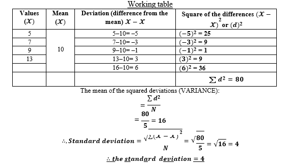
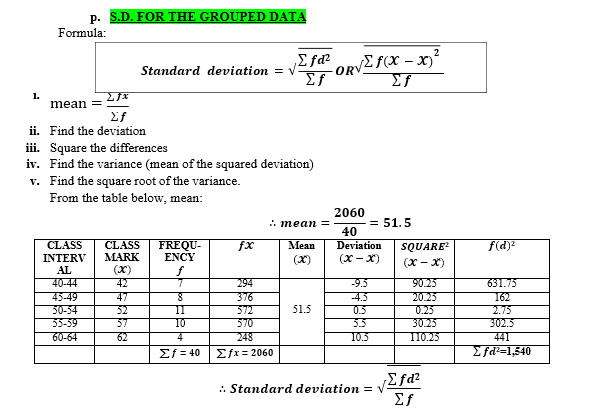
For example, find the Arithmetic mean for the following scores of marks (%).
| CLASS INTERVAL | f | x | fx |
| 91-95 | 0 | 93 | 0 |
| 86-90 | 1 | 88 | 88 |
| 81-85 | 6 | 83 | 498 |
| 76-80 | 10 | 78 | 780 |
| 71-75 | 15 | 73 | 1095 |
| 66-70 | 34 | 68 | 2312 |
| 61-65 | 22 | 63 | 1386 |
| 56-60 | 10 | 58 | 580 |
| 51-55 | 2 | 53 | 106 |
| TOTAL | ∑ 𝒇 = 𝟏𝟎𝟎 | ∑ 𝒇𝓧 = 𝟔𝟖𝟒𝟓 |
SOLUTION

NOTE:
- Arithmetic Mean (𝓧̌) = ∑ 𝒇𝓧
- ∑ 𝒇
Advantages of mean
- It is truly a representative of data, since each vale is involved in
- It is used to measure the centre of a numerical data
- It is used for making comparison in statistical
- It is used to summarise statistical data
- It is used to find other statistical measures in some
Disadvantages of mean
- It is highly affected by extreme values (large or small numbers)
- It is time consuming especially for grouped data
- It cannot be established in open-ended classes e.g. 27+
B. MODE
- Mode is the most frequently occurring value in data distribution. It the score or value that appears more frequently compared to others.
I. Mode for INDIVIDUAL DATA SET,
Sometimes, a given data set may have more than one MODES or NO MODAL at all.
One mode is called UNIMODAL while two modes is called BIMODAL, more than two modes is called MULTIMODAL.
Examples;
- 2, 5, 4, 3, 5, 6, 6, 8, 5, 6
= The modes 5 and 6 {BIMODAL}
- 4, 5, 6, 4, 8, 5, 4
= The mode is 4 {UNIMODAL}
- 4, 9, 8, 5, 6, 7 (= No mode)
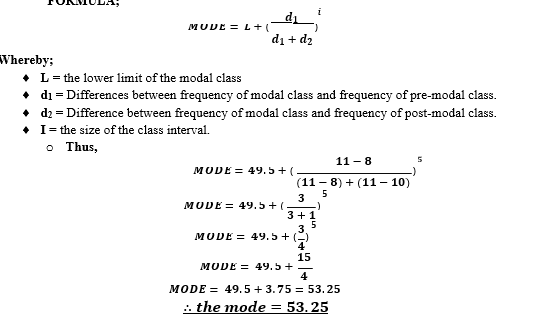
II.MODE FOR THE GROUPED DATA
For example: the tabled data below shows the score of marks in geography subject test for form III
students.
| CLASS INTERVAL | FREQUENCY | ||
| 40-44 | 7 | ||
| 45-49 | 8 | ||
| 50-54 | 11 | ||
| 55-59 | 10 | ||
| 60-64 | 4 | ||
| NOTE:
► Modal class: this is a class with the highest frequency. From the table above it is 50-54. ► Pre-modal class: this is the next lower class from the modal class. From the table above is 45-49. ► Post modal class: this is the next higher class from the modal class. From the table above is 55-59. ► Lower limit of modal class: from the table above: = 50-0.5 = 49.5. FORMULA;
Advantages of mode
Disadvantages of mode
C. MEDIAN It is the middle value which divides the other values into two equal parts, after arranging the given data in ascending or descending order. I. Median for INDIVIDUAL DATA SET If the ungrouped data set is ODD, the median is just the middle value. For example; 1, 2, 1, 4, 6, 5, 3 SOLUTION Arrange in ascending order: 1, 1, 2, 3, 4, 5, 6. ∴ 𝒕𝒉𝒆 𝒎𝒆𝒅𝒊𝒂𝒏 = 𝟑 |
|||
If the ungrouped/individual data set is EVEN, the median is the AVERAGE of the two middle values.
Example: 1, 4, 5, 2, 7, 8, 3, 2
Solution
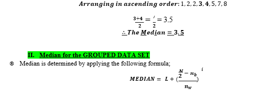
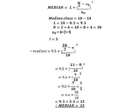
Whereby;
- L = the lower boundary (limit) of the median
- N = The total number of frequency
- 𝒏𝒃= the number of frequency (items) in classes below the median class (lower classes from the median class).
- 𝒏𝒘= the number of frequency within the median
- 𝒊 = the class
For example; calculate the median for the following data
| CLASS INTERVAL | FREQUENCY |
| 0-4 | 2 |
| 5-9 | 6 |
| 10-14 | 10 |
| 15-19 | 8 |
| 20-24 | 4 |
SOLUTION
Advantages of median
- It can be determined for any type of data g. in open ended data
- It may be easy to understand because of being a half-way
- It can be used with non-numeric data if desired unlike mean which cannot be calculated when data is non-numeric.
- It is not affected by extremely large or small values since it is a middle
Disadvantages of median
- Other values in the distribution are not included in its calculation
- It is not suitable for hypothesis
- It cannot be used for further
- It is difficult and time consuming to calculate median from grouped
MEASURES OF VARIABILITY
- Are the ones which asses the variation of values in data set in relation to the
- We often need to measure the extent to which scores in a data set differ from each
- Measures of dispersion/variability include;
1. Range 2. Standard deviation 3. Variance 4. Mean deviation
- RANGE
- Is the difference between the highest and the lowest values in a given set of dat
- FORMULA: Highest value – lowest value.
a. Range for individual/ungrouped data set
- Range is calculated by subtracting the lowest value from the highest value in a data set
- For example, determine the range: 4, 2, 3, 5, 6, 4, 8
SOLUTION
- Highest value= 8;
- Lowest value= 2
- ∴ 𝑹𝒂𝒏𝒈𝒆 = 𝟖 − 𝟐 = 𝟔
b.Range for grouped data set
- Range is calculated by; EITHER
- Subtracting the LOWEST CLASS MARK from the HIGHEST CLASS MARK:
- For example, if the largest class is 20-24 and the smallest is 0-
Solution Lowest class mark = 2 Highest class mark = 22
∴ 𝑹𝒂𝒏𝒈𝒆 = 𝟐𝟐 − 𝟐 = 𝟐𝟎
Subtracting the LOWER LIMITS of the largest and (the LOWER LIMIT) smallest class intervals:
- From the example above;
- Lower limits of the largest class is 20 Lower limit of the smallest class is 0
- ∴ 𝑹𝒂𝒏𝒈𝒆 = 𝟐𝟎 − 𝟎 = 𝟐𝟎
Subtracting the UPER LIMIT of the largest and (the UPPER LMIT of) smallest class
- Upper limit of the largest class is 24
- Upper limit of the smallest class is 4
- ∴ 𝑹𝒂𝒏𝒈𝒆 = 𝟐𝟒 − 𝟒 = 𝟐𝟎
Advantages of range
- It is easy to calculate
- It is easy to understand
Disadvantages of range
- It does not involve all values in its
- It can be difficult to range in open ended
- It is affected by large or small
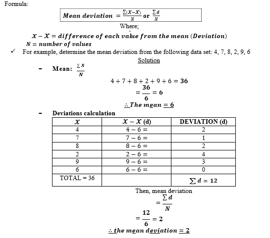
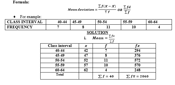
MEAN DEVIATION
Deviation: is the difference between the value and the
𝑫𝒆𝒗𝒊𝒂𝒕𝒊𝒐𝒏 = 𝓧 − 𝓧̌
Mean deviation: is the average of all deviation values, irrespective of SIGNS whether negative or
a.For the individual /UNGROUPED DATA SET
b. For the GROUPED DATA SET

Advantages of mean deviation
- Its calculation involves all values
- It is easier to understand compared to standard deviation
- It can be easier to compute compared to standard deviation
Disadvantages of mean deviation
- It is time consuming to compute
- It is affected by outliers (extreme large or small values)
- Difficult to compute especially when the mean is not a whole
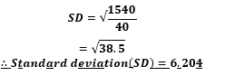
STANDARD DEVIATION
Refers to the common difference of all values from the mean.
It is obtained by adding the squares of deviations and takes the square root of their total value.
It is the measure which determines how far or scattered are the values from the mean.
HOW TO CALCULATE
a. S.D. FOR THE INDIVIDUAL /UNGROUPED DATA
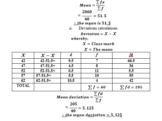
- Find the deviation from the mean (𝓧̌) for each value (𝓧).
- Then, square the differences (deviations).
- Find the mean of the squared deviation. The answer obtained is called
- Take/find the square root of the variance (i.e. the mean of the squared deviations).
- The answer obtained is called Standard
CHARACTERISTICS OF STANDARD DEVIATION
- It is never
- If all values of data set are the same, standard deviation is
- It shows the spread or dispersion of values around the mean of a set of
Advantages of Standard deviation
- All values are involved in calculation
- It is useful for comparing the spread of data of two separate data
Disadvantages of standard deviation
- It is difficult to compute
- It is time consuming to
- It is affected by (large or small values).
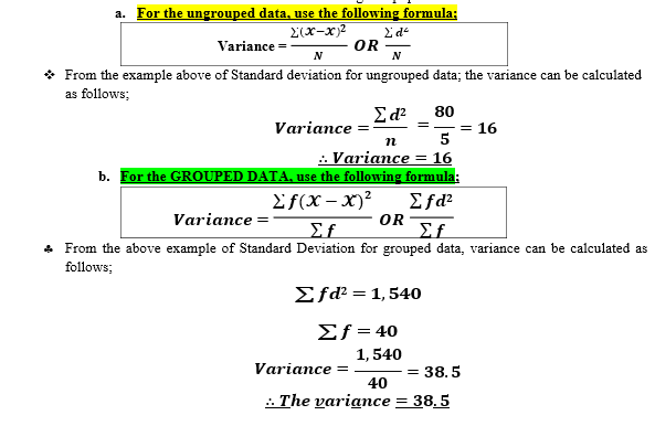
VARIANCE
- Is the square of standard deviation
- It is a measure of how different the elements in a given population are:
IMPORTANCE OF STATISTICS
- It enables the geographers to handle large set of
- If facilitates comparison of different
- It is useful in predicting trend of events, example population
- It facilitates easy collection of data and their storage in form of numbers, graphs, tables and
- It facilitates the process of making relationship between the geographical variables, example climate and production.
- It is useful in local and international level planning and provision of social
- It helps us to understand and describe phenomena in our
- It helps us to store information in form of numbers, graphs, tables and